

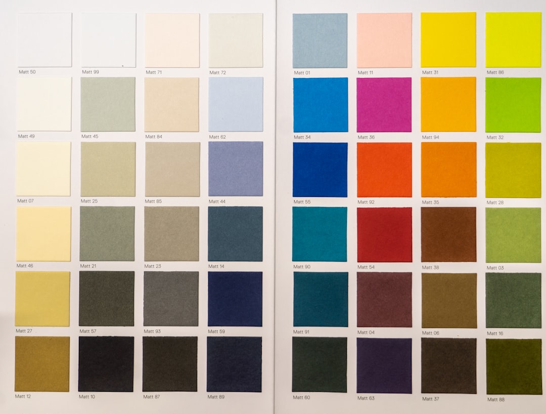
Choosing the right color scheme is one of the most cost-effective ways to change how a space feels. The right palette makes rooms feel larger, cozier, brighter, and more intentional—while the wrong one can undermine even careful decorating. This guide walks through practical steps you can take to pick colors that work with light, furniture, and your daily routines.
Read these clear, actionable strategies and use the checklist at the end to move from indecision to a confident, cohesive color plan for every room in your home.
1. Start by assessing light, size, and function
Natural and artificial light change color perception. North-facing rooms read cooler; south-facing rooms look warmer. Small rooms benefit from lighter palettes, while large rooms can handle deeper tones. Consider the function: restful bedrooms need calmer shades; active spaces like home offices can use more saturated colors.
If you keep books or display items on open shelving, imagine how paint will look behind them—a backdrop that complements rather than competes can make decor pop. For ideas on styles and finishes that pair well with paint choices, browse Bookshelves to see common materials and tones used in modern interiors.
2. Choose a reliable base: neutrals and undertones
Begin with a base color for walls and major fixed surfaces. Neutral doesn’t mean boring—know the undertone (warm, cool, or neutral) and select one that harmonizes with existing floors or large furniture. Undertones show through in certain lighting, so test swatches for both morning and evening light.
Textiles help lock in the base color. If you plan to anchor a bedroom around sheets and bedding, sample paint next to your textiles—natural and synthetic fabrics reflect light differently. Look at curated options such as Bed Sheet Sets to understand common color families and textures that pair well with bedroom wall colors.
3. Use the 60-30-10 rule to balance a palette
The 60-30-10 rule is a practical, visual guideline: 60% dominant (walls), 30% secondary (upholstery, larger furniture), 10% accent (trim, pillows, small décor). This balance keeps rooms cohesive and prevents any one color from overwhelming the space.
For entryways and transitional spaces where you want an immediate impression, choose a strong accent that coordinates with the dominant wall color. Functional pieces like benches can carry both color and texture—see Entryway Benches to visualize how an accent tone reads in a small but important zone.
4. Coordinate with fixed elements: floors, cabinetry, and built-ins
Fixed finishes (hardwood floors, kitchen cabinets, tile) should anchor your palette because they’re expensive to change. Use them as the “base note” and layer colors accordingly. For bedrooms, bedside furniture plays a similar role—select wall colors that work with nightstand tones and wood grains.
If you have or plan to add distinctive bedside furniture, test swatches next to the actual piece. Consider styles like the Night Stand [Unique Curved Profile] when imagining how a wall color will interact with warm or cool wood finishes and hardware.
5. Sample, observe, and refine—don’t trust a single swatch
Buy small paint samples and paint 12″×12″ test patches on multiple walls. Observe them at different times of day and with artificial lighting. Move furniture or a rug into position to see how the color behaves with actual room elements.
Runners and floor coverings change perceived temperature and contrast. Trying a small runner in place can demonstrate whether a color feels warm or cold on the floor-to-wall transition—look at examples like GarveeHome 2×8 Runner Rugs to test how patterns and tones affect a narrow space.
6. Pull color from key furniture and storage pieces
When you can’t or don’t want to repaint fixed pieces, extract palette ideas from prominent furniture. A painted closet, a prominent wardrobe, or a statement storage unit can inspire complementary wall or accent colors.
For entryways and tight halls, storage furniture often defines look and function. If your organization solutions are visually dominant, match or contrast them intentionally—consider how an item like the Xixini Shoe Storage Cabinet for Entryway could anchor an accent wall or be painted to stand out against neutral walls.
7. Choose colors that support multi-use rooms (home office, guest rooms)
Multi-use rooms need flexible color schemes. A combined home office/guest room should be calming enough for sleep but energetic enough for productivity. Opt for a neutral dominant color and add energizing or calming accents depending on the primary use.
Think about your office furniture and how it interacts with wall color. Ergonomic and modern pieces can look stark against warm walls; conversely, a cool paint can emphasize sleek design. If your workspace centers on a prominent chair or desk, preview colors with items like the Ergonomic Office Chair: Mesh Desk Chair in mind.
Practical checklist: make a color decision in 7 steps
- Measure light: note compass direction and times of day with strongest light.
- Pick a base neutral with a clear undertone (warm/cool/neutral).
- Apply the 60-30-10 rule for balance across walls, large furniture, and accents.
- Test paint patches on multiple walls and evaluate morning/evening light.
- Compare paint to key furniture and textiles (bedding, rugs, benches).
- Confirm with small decor: pillows, lamps, or rug samples before full paint.
- Keep swatches and photos for future coordination and touch-ups.
For storage-driven rooms, remember that storage color and finish influence perception. Using clear or neutral storage keeps color schemes uncluttered—consider reliable organizing solutions like Plastic Storage Bins with Lids to maintain visual calm in closets and utility areas.
Small furniture pieces can make big visual differences. Storage benches and chests are both functional and decorative; seeing them in a room helps finalize color choices. Browse options such as the VASAGLE Storage Chest, Storage Bench if you want to test how an accent furniture tone reads against your chosen wall color.
Once you’ve made a choice, commit to two test rooms before repainting the whole house: one with bright light, one with limited natural light. That gives a realistic picture of how your palette will behave across conditions.
FAQ
Q: How do I pick a paint undertone?
A: Compare swatches under natural light and next to key materials (wood, upholstery). Cool undertones have blue/green hints; warm undertones lean yellow/peach. If unsure, choose a labeled “greige” or neutral with photos in both warm and cool lighting.
Q: Should ceilings be the same color as walls?
A: For low ceilings, a lighter ceiling color creates height. For tall rooms, painting ceilings a shade darker can add coziness. Match trim to ceiling for cohesion, or use white trim for a crisp look.
Q: What if my furniture limits color options?
A: Use furniture as inspiration: pick a neutral wall that complements dominant furniture tones, then add accent colors in pillows, rugs, and art to bridge contrasts.
Q: How do I make small rooms feel larger with color?
A: Use lighter, cooler tones and keep contrast between walls and trim low. A continuous floor color and minimal visual breaks also enlarge perception.
Q: Can I mix warm and cool colors in the same home?
A: Yes—limit mixing within a room and use consistent undertones or unifying accents to tie different palettes together across rooms.
Q: How many paint samples should I try?
A: At least three: your chosen base, a lighter variation, and a slightly deeper option. Observe all three in your space before deciding.
Practical takeaway: choose a reliable neutral base, test it across real light and alongside key furniture, then use the 60-30-10 rule to add depth. Small changes in textiles and storage can dramatically shift perception without repainting—use those pieces as your final decision-makers.
Products Featured in This Article
![Night Stand [Unique Curved Profile]...](https://homecovepicks.com/wp-content/uploads/2026/07/71oLWjNoK7L._AC_SL1500_-300x300.jpg)
Night Stand [Unique Curved Profile]…
From the brand TV Stand for TVs Up to 65” Curved Nightstand(Oaked Gray) Curved Nightstand(Brown) Curved…

Ergonomic Office Chair: Mesh Desk C…
From the brand Designed for Work, Engineered for You At Ergalithic, we don’t just make office…

VASAGLE Storage Chest, Storage Benc…
Product description Spacious to Organize More Items Large Capacity The large hidden compartment of this storage…

Xixini Shoe Storage Cabinet for Ent…
Product description Make Your Entryway Neat & Organized with XIXINI Shoe Storage Cabinet The video showcases…
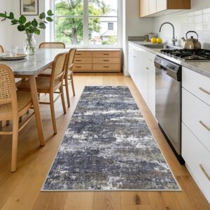
GarveeHome 2×8 Runner Rugs Mac…
Product description Washable Area Rug with Non-Slip Backing: This modern abstract area rug is crafted with…